Monday, 22 November 2010

Monday, 15 November 2010
 This is the front page of the Chronicle which i have loosely based my design on, i will be posting my first designs shortly and show all the difference as it changes. The front page has the unmistakable big blue heading 'Chronicle' with Evening in black italics just above it, in order for the name to be shown off without Evening getting in the way or take up any unnecessary room.
The is the large Bold Black main story title in the exact middle of the page giving it influence and purpose with the small picture at the right of it, this is due to the headline having more grab then the picture. The amazing side story of the baby born on all 10's, 10.10 am at 10/10/10, this is a large side story not often used but its significance with the strangeness of it allows it to be placed here. Finally there are the advertisements where a large bulk of the papers money comes from at the top and bottom with their page numbers and/or numbers/emails.
 This is the back page, where all the sport is usually at. I am going to be doing a football story so this area is good for me. It is different as it is like the front page but in reverse, all major stories and where to find/finish them off are. For example the story here 'Hughton ponders future of Xisco' has the start of the story but at the bottom suggests which page to go to from here. It even changes its name saying 'Chronicle Sport', however the conventions of this paper are keeping the first word, in this case Chronicle, in Italics and black but not bold, and the second one, Sport, in Bold Blue.
The main picture is usually on the top, with a page to direct people to for the story, with the start of their main Sport article at the bottom half, they have went with the pub of 'United Boss Sol-Searching' it is in Bold Black with a small pictures of the player in the corner. All pages in this paper are layed out into specific sectioned areas so that they do not move over into one another.

On the following sections we have three different pages each filled with their own stories and headlines. On this particular one we see the main middle story is 'Gazza Arrested behind wheel', they use the term 'Gazza' for his name as this is a local Paper and those around the area call him by his nickname rather then his full name. There is a large picture of him situated just below the headline and almost in the exact middle of the page. The obvious side stories such as the 'Face of a street thief'. Another convention is the Chronicle section on the left of the page, this includes the uses of new technologies not just the post, is shows their email and how you can text in order to help get news as it comes in, there website and what you can read when you do log on.
In this picture of 'Gazza' you see the picture is used to really show of him, the officers are in the foreground but still shown off however with Gazza to the left and at the front of them really secludes him from them and everyone.

This page involves the strange story of baby Jessica who is born at 10:10am on the 10/10/10. Papers always use puns in their headlines and story names, this is no different, they use '10 out of 10!' a good name to really attract the reader in, the obvious bold and black that is seen throughout. They place a picture of her at the top of the page on a floor surrounded by 10's, this is to show the strangeness of her birth and to again put forward the significance of the 10's. They however use again the same picture from the front page is on the bottom left of this page, something that doesn't often happen and only does if they believe it is the best one that they could ever use or if the pictures fits in perfectly to both pages, it shows her and her mother, both perfectly framed taking up most the room and neither is really centered to show they are both significant here. And again we see adverts, this time in the bottom right of the page, however taking up a lot more room then usual.
 This is the final page that i have scanned and looked at very closely. It has two main stories on it, most distinguished and showded in the terms of picture is the 'Cubs taste success' however the main one too attract the reader through the conventional black bold headline is the 'Arsonists tried to kill neighbour over Dirty look', this one is obviously trying to draw in readers who want to see the hard hitting story but start of with something soft and a 'soft' picture if the young 'Cub' eating the sandwhich. This use of pictures and headlines allows for a variation in story to really get the reader more into the paper and be pushed to read more without a sudden shock but steady build up and light hearted stories combined with the hard hitting and shocking stories.
All stories are layed out in the same format, selctive sections for each bit, for instance the headline is in its own blocked areas, so are the pictures and the text, it is all formatted to fit into specific blocks, so as to be easy to make/edit and easier for the readers to get through and read without getting lost.
Monday, 8 November 2010
 Analysing the papers
Wednesday, 20 October 2010
The main story is to be a Robbery in Newcastle
The two side stories are : Celebrity Binge Fight and a Back page Newcastle game shock
The name of my newspaper is to be 'The Eye' as it really attracts others and looking for a sort of pun Eyes in on the stories and scoops
Wednesday, 13 October 2010
These are a selection of poster advertisements done by various papers to attract readers:


The Shropshire Star wanted to promote their sponsorship of the annual RAF Cosford Air Show. Therefore making their newspaper a paper airoplane was the idea they eventually came up with.
Monday, 11 October 2010
1) How often do you buy a newspaper?
Every other day [ ]
Once a week [ ]
Once a Month [ ]
Once a Year [ ]
Never [ ]
2) Do you buy the Newspaper for one particular Story or another reason?
One Story [ ]
All the Stories [ ]
The pictures [ ]
The headlines [ ]
Other (Specify Below) [ ]
…………………………………………………
3) Which Stories in the paper do you read the most?
The Sport [ ]
The Main Articles [ ]
Political [ ]
Hard Hitting [ ]
Other (Specify Below) [ ]
…………………………………………………..
4) What From these Stories attracts you the most?
The Headlines [ ]
The Realism [ ]
The Pictures [ ]
The Facts [ ]
Other (Specify Below) [ ]
…………………………………………………..
5) Do you pay more attention to the stories or advertisements?
The stories [ ]
Advertisements [ ]
Both [ ]
6) Which of these Newspapers do you prefer?
The Sun [ ]
The Chronicle [ ]
The Guardian [ ]
The Independent [ ]
The Daily Mail [ ]
Other (Specify Below) [ ]
…………………………………………………..
7) Out of these what would be the best name for a new Newspaper?
The Eye [ ]
The Vision [ ]
The Star [ ]
The Excel [ ]
8) Do you prefer Celebrity Scandals or Average people Problem Stories?
Celebrity Scandals [ ]
Problem Stories [ ]
Both [ ]
Neither [ ]
9) When buying a Newspaper what colours draw you in more?
Red [ ]
Blue [ ]
Orange [ ]
Grey [ ]
Black [ ]
Other (Specify Below) [ ]
………………………………………………..
10) What Price would you consider reasonable for a Newspaper?
25-50p [ ]
50-75p [ ]
75p-£1 [ ]
£1-1.50 [ ]
I am going to create a questionnaire to see what exactly attracts people to the Newspapers, however it will also look to which ones people view are the best, why and if there is any other reasons as to why they purchase a Newspaper. Predominantly these news papers are going to be ages at those of a middle aged range, for example 30-50 year olds, however it must cater for those of younger ages, 15-21 as they find time to read them when their is a special story about something on the television, and most of all the older age group of 50-60+ as they also are prone to reading Newspapers in their spare time. I will ask 100 people however for this i will focus on 30-50 year olds, they have experience and can give a fair reflection onto what i need.
Wednesday, 6 October 2010
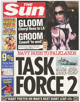
Before Deciding this i have decided to look at and analyse both The Chronicle and The Sun.


I have decided to go with a Newspaper more like The Sun rather then any others, however i will of course look at others for inspiration and guidance. Therefore my paper will consist a current event in the sports world as well as a hard hitting story, as well as things political or governmental.
For my three Featured stories i have came up originally with 6 ideas to choose from. I want a hard hitting story for my main one, something related to a current event for one the others for example something to do with a TV show/series and finally i decided to go with a football related accident.
I have gotten down to these six, only three of which i could choose:
Main:
1. The Death Penalty Debate
2. A Policeman saves a life
Side Articles:
1. Xfactor star scandal
2. Celebrity binge fight
3. Manager caught cheating
4. England Player injury
From these six, i have to choose 2 side articles and one from the Main.
For my year 13 media practical production i am going to be working by myself in order to create a Newspaper with one major story and two other Articles, all three of these i have to make up and create on my own and with my own design and name. I will also have to produce a radio advert for my Newspaper which will outline how my Newspaper can bring the best information for the public and should draw them in and a poster to advatise my newpaper to the public. I decided to do this as it seems very interesting and working on my own to create it will be a good challenge for me and provide some great experience.
I will be looking towards all genres of Newspapers such as The truly hard hitting and political ones, The Chronicle/Daily Mail, and the other more Sport related and real to life specified ones such as The Sun, however it also includes Politics it usually cartoons them and makes them into practical jokes . Both are two of the most sold Newspapers in the country.
Wednesday, 5 May 2010


Monday, 15 March 2010
How I have challenged real media products conventions in rock magazines?
Before I started my project, to create a music magazine front cover, contents page and article. I looked at other magazines, the conventions of them and how they will relate to my magazine. I found most of them on Google images and then went to their home pages to find more of the pictures, http://www2.kerrang.com/2008/07/slipknot_in_next_weeks_kerrang.html/2008/07/slipknot_in_next_weeks_kerrang.html/2008/07/slipknot_in_next_weeks_kerrang.html.
These pictures of the Kerrang magazine were exactly what I needed for my front cover inspiration. I realised the conventions of these magazines and other that I found on http://www.mojo4music.com/blog/music.com/blog/music.com/blog/ and other websites I will quote later on. I read both Mojo (2008) and Kerrang (2009) magazines, 6 Mojo and 10 Kerrang in order to see what conventions were needed. My magazine seemed to be aimed at teenagers and young men in their twenties, so I made my age range at 14 to 25, as my magazine has both older and newer music in it.
 These magazines use ideology, promoting the cultural value system, which is why they use models on their covers that can attract the audience in. The conventions showed that the magazines only used between three and four colours and only two or three fonts, as I checked through other Kerrang magazines, it being my main style model as it follows the same age range and rock genre as what I wanted for my magazine. It is aimed at teenagers and those ranging from fourteen up to at least twenty-five, largely but not exclusively males. My magazine keeps a lot of the conventions, with my models head over the name of the magazine, I have other simple conventions such as the bar code, the price and the date, the placement of the text, my models have been taken at a medium long shot position just like in most of the other magazines, a medium long shot is the most common of the shots such as the shot on my front cover, contents page and main articles, this stops them from getting into the way of my other stories however still keeps them as the centre and main view on the magazine.
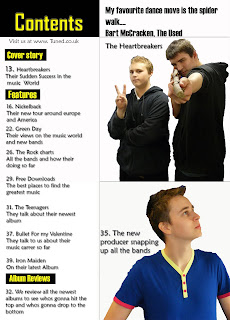
I used three colours for my front cover just like the normal convention such as in Kerrang and Mojo magazines; I also have just used two types of fonts, which are also common in all genres of magazines. For the pictures on my magazine, for them I first had to make sure their was no glare on them and it was in a dark place so my pictures did not have white spots on them of the lights, I first cropped and cut them all out so I knew what I was working .For the pictures on my contents page (shown later) I cut the images out to change their hairstyles and give my ‘producer’ a more important feel, especially since the pose made him seem important, I then sharpened the image, and altered the colour balance in order to turn him from white and pale to a more tanned tone of skin so he looked more like a producer and richer instead of just a pale person with who I took a photo of, a tanned skin makes them look more important. However for my pictures on my main article all I did was crop, cut and sharpen as when looked at they did not need touching up. All of my photos taken are from medium long shots, a few photos I took were from closer and longer but the convention is to have medium long shots for your pictures, unless you’re featuring either just one person or more then three people, as with both you need to be able to fit the page, so with two its better to do the shots from a medium long range in order to fit more on.
 How does my media product represent social groups?
My magazine has an age range of twelve to twenty-one, this makes my magazine perfect as it really does appeal to this age range, it is mainly looking at men/boys of these ages and with my main story models being men they will aspire to be like them. They come from a working class and this represents working class young males in a positive light, showing that anyone can rise to be great and achieve success; the readers will also be sympathetic towards them because of their personal life and upbringing, they are down to earth and easy for my audience to relate to because of there working class background and 'everyday' clothing. They had struggled with all sorts of problems in their life and had in this not long lost their grandmother, this puts them in a very positive light, some readers may even sympathise with them, making them the perfect role models for the readers. The price of the magazine is also within a good range for my target audience as £2.50 seems within a reasonable price for them, as many may not have the best income, especially those who are unable to get jobs, my survey provided the evidence that this price was reasonable for my type of magazine, there is also enough in the magazine to last them until the next issue without spending to much of their money to get it, although it seems a lot for a weekly magazine you get more information than Kerrang and a more wider range of music to select from and read. Also with it being a once a week magazine they do not have to long to wait to see the latest news and have enough information to talk with their friends about during the week period, I decided on a weekly magazine as in my surveys it showed that this was the best choice. This magazine would compete with the likes of Kerrang, which is weekly, and Mojo, which is monthly, those who were my style models.
What institution might describe my media product and why?
Because it is most like Kerrang I would choose the most influential and biggest distributor, Bauer Media http://www.bauermedia.co.uk/ a private company that deals with distributing magazines throughout Europe, in Germany, France and Spain however they also publish in the USA China and Russia. Bauer publishes all the best magazines especially when it comes to rock, with Kerrang and Mojo, the biggest three in rock magazines and because they publish these there is a high chance that they will publish my media project as it follows all the same conventions and genre. It will also be competeting against them at the same time and to Bauer this is perfect as it means that their magazines will be sold a lot quicker and in more numbers as the competition will draw in the reader as it fights to beat the other magazines. My magazine is weekly and cheaper, it appeals to the audience with weekly news of downloads and will increase Bauer’s profits.
 Who would be the target audience?
When I was deciding my main audience for my magazine, I chose males 14-25, this is because I looked at as many rock magazines as I could find possible and whom they featured in them, I also observed the other people who looked at or bought these magazines. I realised that a lot of them were between the 14 to 25 mark, however there were those who were slightly younger who seemed to like to read all about there favourite bands, even if sometimes they could not always buy the magazines, they liked the occasional one to read. I also noticed that a lot of the buyers were male, only one or two were female, the rest of the females tended to look more towards the lifestyle and fashion magazines such as ‘Heat’ and ‘Closer’, and that the buyers seemed to be from an upper working class background.
 Name: Andrew Carroll
Age: 16
Gender: Male
Interests: Music (specifically rock), football, cars
Job/Profession: Sales Assistant/ Student
Income: £200
How did I attract/address my audience?
When I was thinking about attracting my audience I had to use various techniques. These techniques consisted of the content inside the magazine, the language that is used to pull the reader in, the models that have been used on and in the magazine, the colours and the fonts used. My main story for my magazine is the rise of a new band, it is nothing new but the fact that they rose to the number three spot in such a quick time will shock the reader/audience, drawing them in. Throughout the magazine I used colloquial language; this is because it is shown that talking more informally to the audience allows them to relate to the magazine so they are more likely to buy it. This is using Blumler and Katz's uses and gratifications (1974) they saw that media generally seek to gratify, personal identity, which is exploring or reinforcing our own values through comparison with others values and Surveillance which is the need for a constant supply of information about what is happening in the world, so in my case what is going on in the music world. The colours in my magazine, the blacks and whites, have connotations of masculinity and allow the males to identify with the magazine and there ‘black and white’ rock based lifestyles. I also surveyed my target audience to find out what they wanted in a magazine and I looked at other successful magazines, Kerrang and Mojo in order to look how to appeal to my target audience.

My models for the magazine are around the same age to my target audience so this will appeal to my audience and draw them further in. The main characters ages are meant to be older then that of the reader as they will see them as someone to aspire to and try to relate to their situation as well as wanting to become what they have become. I also thought about adding in more adds or promotions to my magazine; however I did not want something on the front page taking up to much room so instead I chose to put in a Linkin Park poster inside so that they would have something else in the magazine
What have I learnt from the process of creating this product?
At the beginning I knew nothing about adobe Photoshop, or about digital photography, however throughout my projects I learnt about certain techniques on adobe such as rendering the pictures and air brushing them to make them look more effective on my magazine especially the cover, using air brush can correct some faults, not with the picture but with the model themselves, such as little imperfections that seemed to stand out and not seem right. I also learned about different angles in which to take pictures such as long angle shots and medium close up's. I also was able to find perfect lighting conditions, and background conditions so that there wouldn’t be any glair or light problems on my pictures, this would be a problem when it came to rendering them as the light would cover the models face and would be almost impossible to remove this light. However there were some problems with lighting, I managed to see it on the pictures and go back to change the areas around so that the glare would not come up again. On Adobe I started off not even knowing how to cut out pictures or create a background now I can create full magazine covers with very limited problems. For my contents Picture of my models I cut the images out to change their hairstyles and give my ‘producer’ a more important feel, especially since the pose made him seem important, I then sharpened the image, and altered the colour balance in order to turn him from white and pale to a more tanned tone of skin so he looked more like a producer and richer instead of just a pale person with who I took a photo of, a tanned skin makes them look more important. I have also learnt how to use the blog https://www.blogger.com/, it has allowed me to combine images and text and become a producer of a media artefact that can be seen and commented on by a worldwide audience.
Looking back at my preliminary task, what do I feel I have learnt in the progression from it to the full product?
When I look at my preliminary task I now that my knowledge has increased a lot since then. When doing my preliminary task I did not study any conventions of magazines, however this time I did a thorough study of magazines. I had to study about what will attract people and my target audience with my main magazine. For my main magazine I also had to think about what my competition would be, as I would have to match and beat those competitors. When I look at the preliminary task compared to my main magazine I can see the style of it and the practical aspects, my main magazine is a lot more stylish and has the better look and feel of an actual magazine. For the practical side of things I looked at the colour and the fonts and styles of language that could be used to make the photos more effective and make my magazine look more professional. I figured all of this out thanks to researching it all; also my production skills have improved as well as my understanding of conventions and of the magazine market. For my pictures, I have learnt about image manipulating and air brushing to render the pictures and make them look more authentic and add any tiny details that cannot be added without the technology, such as how to blur an image or to change the colour tones to remove any light problems from glare of the sun.
I managed to get some very positive comments from my target range audience, here are a few of them; Garry Anderson 19 said ‘ This is a very bold magazine, it really speaks to me and I would think that I would buy it ‘, he also mentioned ‘It is very loud, the picture on the front captured my eye and the story that comes with it really intrigues me’, Sam Marshal 17 said ‘I think it looks very good, and with all that you get in it, the price seems actually very fair‘. They were all very good comments and showed me how my magazine faired in the real world.